Design
it's all about communication
 Design is about communication - it's about finding effective ways to communicate a message, an idea. Whether you're listening and looking, or talking and showing, when you communicate, you're organizing and presenting your thoughts, along with the thoughts and ideas of others that you've integrated. Ultimately, it's about trying to convey those ideas and images you have in your head to one or more other people.
Whether it's pen on paper, a saw on wood, photoshop on an image, or film on the world, every day we interact with and form the world around us — we send and receive messages. Sometimes, we communicate with other people, but we can as easily communicate with a computer (open this file), or a car (start now), or a piece of food (give me proteins and carbohydrates). Good design is nothing more than clear communication. And every communication involves design, even if it is merely the "design" of a sentence to express an instruction: "go get the Jabberwocky file" is a designed intention, intended to produce a predictable result.
Consider the blinking 12:00 on your VCR - you know perfectly well how to tell time, and so does the VCR. The problem is that you don't know how to communicate to the VCR what time it is right now. The VCR has a language, encoded in the words and symbols of its buttons, one which you cannot speak. This is a good example of bad design - the VCR is not communicating how it works with you, and you, no matter how loudly you yell, are not communicating with your VCR.
There is a chasm between blindly expressing intentions, which we all know how to do, and understanding design the and process of design thoroughly enough to communicate well. There is a difference between knowing the path, and walking it. But there is no great mystery involved - it involves practice, and paying attention. One of the founding pillars of Toltec wisdom is "be impeccable with your word" — literally, mean what you say, and more importantly, understand how to say what you mean, and only what you mean.
everybody does it
No matter what you're doing, you're designing. Whether by direct intent (writing a business plan, architecting a home or a community, or designing a web site), or more implicitly (picking up around the house, choosing a route to the store, or choosing your words in case you have to eat them), when you express yourself, you are designing - you are crafting a message. Whatever tools you use to express yourself (from typing to speaking to waving your hands), you know when you're doing it. But, have you stopped to think about what it is you're actually doing when trying to express yourself? Do you know how you do it?
Be it a web site, an essay on philosophy, a really cool new blender or your next sentence, there is intent behind the form and function of the object of someone's attention, some of which you are directly responsible for. The web, like all tangible products, is a medium of remote communication - you can at best take an educated guess (sometimes based on study and user interaction design) about how a user will interact with what you've set down - you are forced to predict how someone else will learn what you're trying to convey.
Design, like all forms of creative expression, is a craft - it is an applied skill, and it can be learned. My personal rule of thumb is that it takes about 5 minutes to learn an idea, 5 years to learn how to effectively express your ideas, and about 10 years to really be an expert at anything. Don't despair - you don't have to wait 10 years to get started, and you don't have to go to school for 10 years to learn something. But do realize that, like all applied skills, it takes a lot of time and energy to learn to do something particularly well.
All creative media expression is just that - creative expression. By definition, it is opinion based. There are no hard and fast rules (in my opinion) - just rules of thumb. It's the difference between theory and proof. So, take everything you learn, from me or someone else, with the proverbial grain of salt. Learn what you can from other people's ideas, even if what you learn is how wrong everyone else is, and how right you are. Learn that believing you're right is part and parcel of good design - if you're not absolutely convinced that what you're doing is better, you'll have a hard time convincing someone else. And remember - you're already a designer; now, start paying attention to how you do what you do, and how others do it, and you will already be learning how to be a better designer, and a better communicator. Everybody does it, but not everybody does it well.
design 1, art 0
Despite the fact that art ( I would say true art, but then I'd have to defend it ) deals inherently with the new, it is inherently about taking things apart. This isn't bad; I don't mean that it's destructive - just that the artist's role is that of provocateur and commentator. The artist shake's things up - they are bringers of chaos. We need chaos - change is good.
Design, by contrast, is about making sense out, finding patterns, making connections - it is intrinsically about bringing order, and meaning. The artist sees problems, the designer sees solutions. Let me be quick to point out that the neither the artist nor the designer causes the problems, or the solutions - they see the problems, and the solutions. There is nothing negative about either role - they require each other, and define each other. Design is the business of doing, art is the business of being. And they are not mutually exclusive - in fact, we are all both.
A good web site, a good business, a good day, a good anything requires both - design without art is sterile, art without design is puerile ( static dynamic, meaningless ). Culturally, we pay designers (it is a profession), while alternately tolerating and revering artists - but if you've got a steady salary, you're more likely a designer by trade than artist. Which is the source of much conflict - we are all at heart both, and good work requires both. Frequently, we create something that is all too obviously designed, or all too obviously art for art's sake, and forget about the viewer. We get too caught up in the process without paying attention to it, and forget entirely about the goal - the interaction of someone else to bring life to our creations, be they businesses, art projects, web sites or hand-knitted socks.
If you're setting out to learn to design, remember that there is a difference between something that is beautiful, and something that is meaningful, and only rarely do we hit that note where what we're doing is both (or even one of the two). There is a gap between being able to do something that you think is cool, and something that everyone thinks is great. Reaching an audience of more than one takes patience and attention to get right. Pay attention to everything, and don't give up.
![]()
I love Go. It's a 4,000 year-old game that is at once design and art. It is once a minimal language for expressing your design on the space you're trying to capture, and an image that is somehow beautiful in a way unrelated to the game itself being played. You can see the end of the game (on the right) in the beginning of the game on the left - the design communicates itself. But the image of the pinwheel or flower (or whatever you see) on the right is a complete accident. A design that unintentionally supersedes itself to become art.
taking the world apart
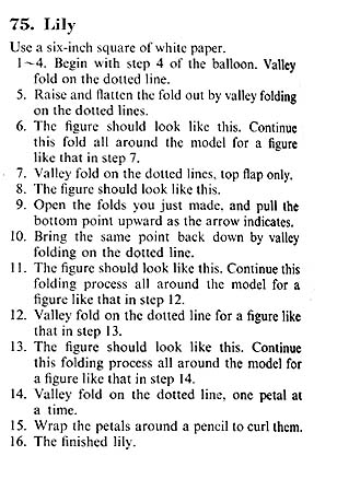
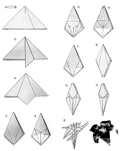
The above two illustrations are two different sets of instructions for folding a piece of square paper into a Lily. One is text, the other pictures. But both are a form of instruction; in both cases, the goal is to inform the reader or viewer how to do something in a discrete number of steps. Explaining anything, communicating anything requires that you take it apart.
Even if, for instance, you are verbally telling someone how to sharpen a pencil with the new pencil sharpener, you are speaking - you are connecting individual words in sequence in order to convey your point. Every time you communicate, you are taking your thoughts apart into pieces in order to convey them to someone else. As I mentioned, art is the business of taking things apart, and design is the business of putting them together. You have to take the world apart to fit it on a "page."
Good design requires the ability to see the pieces of a thing, in order to convey what they are and how they relate to each other, whether they are the pages of a web site or the parts of an engine. There are, as the illustrations above show, different ways to "show" or "map" information, to convey meaning. But before you can put things together, before you design a web site, or write a proposal, or build a home, you have to take things apart. You do it unconsciously already - now you have to learn how to do it consciously, which ultimately comes through practice.
informing the user
![]()
The graph on the left shows the relative relationship of efficiency of different room designs with respect to air turnover (how fast does fresh air move through a room with different windows, heating and cooling, and physical arrangement). By using different colors, a number of options (5 in this case) can be shown on the same graph.
Now take a look at the detail of the graph.
![]() You can see that the bars themselves are spaced differently - they are not exactly the same distance apart. And the numbers at the bottom (which correspond to the heights of the various columns) do not line up on the left or the right. The reason for this is that the eye "reads" colors and shapes in interesting ways - when looking at the graph, you tend to perceive the columns being equally spaced and regular. In fact, the spacing and color is very calculated - knowing that red and blue tend to "interfere" with respect to perception, they've got a little more physical space so that the mind will keep them apart.
You can see that the bars themselves are spaced differently - they are not exactly the same distance apart. And the numbers at the bottom (which correspond to the heights of the various columns) do not line up on the left or the right. The reason for this is that the eye "reads" colors and shapes in interesting ways - when looking at the graph, you tend to perceive the columns being equally spaced and regular. In fact, the spacing and color is very calculated - knowing that red and blue tend to "interfere" with respect to perception, they've got a little more physical space so that the mind will keep them apart.
This is all conscious and intentional; the designer has made tiny adjustments to the image, based on his or her knowledge of color and perception, in order to help the user or viewer best "read" the image. The designer is doing their best to control your perceptions - to communicate. Every facet of what we do, of what we design has in impact on the receiver - color, shape, size, position, relationship, context, figure, ground. The details, the specifics of how the shapes, colors and words are arranged all affect what you see.
In the end, it's what the other participant "gets" that it's all about - doing out best to insure that the other person or people hear what we intended to say, as loudly and clearly or subtly and quietly as we wanted.
get it out of your head
The first step in design and communication is to discover what you're trying to say, or in many cases, what your client or your company is trying to say. You have to get the message out of your head, out of other people's head, and into the world. You can turn the message into pictures, or words, or diagrams. You can add color or make it black and white. You can hold it still or make it move, speak it aloud or transmit it electronically. But you have to take the idea, the world in your head apart, and break it into pieces that other people can take in and which they can hopefully "reassemble" into the message you intended.
There are a host of tools and techniques that can help you do this, but you already have many at your disposal. This week's assignment is to "use any means necessary (always) to 'design' a web page." The end product doesn't have to be a working site on the web, it has to be a message that communicates what the web site would be, would look like, would do. For this, you can use words, and write about what you envision. You can write in narrative form, or as an outline. You might draw a diagram, or a road map. You might prefer to draw what you think the individual pages look like. But, the point is not to figure out how to make something look good (yet), it's how make something make sense. The point of "use any means necessary" is an exercise in what it means to design.
It's perfectly ok, for instance to type up a one page description of a web site you'd like to build. Or, to write a one page rant about a site you hate, and how you'd fix it. Or to build a model of something you want to build, or that you want to show. Or to write a one page message that you'd like to communicate with someone. The operative word in this is communicate. What is the message that you have, or that you see someone else has? Get it out of your head, and into some form that you can communicate with someone else.