The Art of Implementation
bandwidth Let's face it, this is the single biggest constraint on design today - most information has to be tailored fit over antiquated copper wires to the home. A general rule of thumb is that the html and the images that constitute a page should be no more than 40K for fast download times. If the content is only being distributed over a local area network, this constraint is usually lifted, but it's hard to know for certain who will look at a web site.
screen/display Although a computer monitor has a much higher resolution than conventional television, the information density on the screen is low - 72 pixels per inch. A photo-quality printer, by contrast, has about 3000 pixels per inch. Because of the monitor itself, the web doesn't lend itself to the kind of content you might put on paper. Since virtually every image is either a GIF or a JPEG (compression formats), yet more information is lost in the storage format.
Further, all other media have a fixed information density. Televisions change size, but have the same picture no matter what the size (one simply sits further away). Books, magazines and newspapers have a fixed size. But the screen resolution changes from one person's monitor to the next, and more, the browser window can take up any portion of the screen. As a result, most computer interfaces have to have the flexibility to fit in a fairly small window, while stretching to fill the screen if need be.
color The web palette is extremely limited; subtle nuances and shading become extremely difficult — thus the trend in site design towards blocks of complementary and contrasting colors to delineate different areas and meaning, rather than subtle embellishment.
All of the above mean the same thing: in designing for the web, one must significantly limit the density of information on a page, both in terms of screen space utilized, and in terms of image quality.
protocols HTML was never designed to lay out graphic pages, let alone with the precision that most design tools allow today. More on this below, but a designer has severe limits on how accurately things can line up and overlap. Images, for instance, can either be left, center, or right-justified. Again, this can be seen in the generally sparse way that pieces of information are scattered on the web page. Cascading Style Sheets (CSS), Flash, and soon Extended Markup Language (XML) all offer new ways to structure content on the page. CSS in particular will allow multiple layers, and (theoretically) to-the-pixel alignment. Unfortunately, there is a great deal of inconsistency in the support for these protocols across browsers and platforms, and as a result, it becomes extremely important to preview designs on a wide variety of machines and configurations before one can be certain of the desired result.
Creative use of tables, spacer-images, javascript, and other "tricks" (webmonkey is a good source for these things) allows more customized pages than would appear obvious at first glance, but again, this requires developing a specialized knowledge and set of skills which are certain to become obsolete as protocols evolve. In general, Lynda Weinman's book is probably the single best resource for designing and processing graphics for today's web.
model of rome built in a day
By now, you've probably noticed that for a course that's ostensibly on "web design," I've said relatively little on the nitty gritty aspects of designing a web site, or using a particular tool set, nor have I used many illustrations from the web proper. In large part, this is because I believe one has to firmly understand the underlying principles of design and the inner workings of one's medium before one can hope to practically apply any particular skill set. Also, once understood and eventually mastered in a general way, a skill becomes easy to apply to a particular task, such as designing a web site, an information architecture, or any design task. Finally, the state of the web is transitory at best — HTML is dead, and the days of the GIF and text web site are numbered — or more accurately, broadband Internet will explore and explode whole new fields of interaction and content, demanding ever-greater versatility from the designer. Having only one skill or mastering only one tool won't serve you well in the long run.
As I've said elsewhere, "web design" is nothing more than a specific application of more general skills, including Information, Interaction, Graphic and Interface Design. Many of the constraints specific to web pages today are artificial — they stem from limitations in bandwidth and the current version of the HTML protocol, and these limitations will go away over the next few years. Stressing that a web page should be no more than 40K in size, or focusing on what a particular browser version is capable of are important constraints to understand, but only for the moment.
Ultimately, the best way to fully learn any skill is by applying it; making mistakes and getting lost are important parts of the learning and discovery process. My goal has been to lay a solid framework for understanding how things work, the specifics are in large part a matter of personal style. To be fair, this is also my own particular m.o. — I tend to design from the top down, and prefer to understand the bigger picture before taking something apart or putting it together. Many people prefer a bottom up approach, beginning with the first piece of the puzzle without knowing what the end result will be. Both approaches are useful and effective; as I say, it is in part a matter of style.
I've tried to address below some of the more basic issues in creating a specific web page and / or web interface, by showing how to structure and break apart an actual page.
laying it out
How do you figure out what goes into a design on a particular page? This is a tricky issue: the design tools themselves don't necessarily have any limitations. Photoshop, Quark, Illustrator have no real constraints on size, density, color, layers - you are more or less free to design whatever comes to mind. However, the web itself currently has a great many constraints:
For now, designing for the web means tailoring one's work to meet the limitations of the medium, while also accounting for the constraints of a particular project — does it have to work on every screen in the world, or only over a corporate network? Bandwidth will continue to expand, and the protocols that define the web will continue to evolve until you can actually guarantee that someone will see what it is you've intended and designed. best to have a general understanding you're applying to a specific situation, so you can deal with new situations when they arise.
solving the puzzle
For now, the web is extremely flat; it doesn't support the complex layering that one can achieve in Photoshop or Quark, for instance. In fact, until CSS, HTML provided for exactly two layers - foreground and background. And the background image in HTML tiles - it repeats itself from left to right and top to bottom until it fills the screen (to eliminate that effect, use an image that's larger than the largest screen size - say 1200x1600 - but beware size and bandwidth constraints). Unfortunately, style sheets provide more options, and Dreamweaver supports style sheets. I say unfortunately, because without understanding how CSS will be interpreted from one machine to the next, designers who are used to using such techniques in print can readily apply apparently similar techniques to the web, without fully understanding the issues or implications. For simplicity, I'll stick to explaining how to lay things out with HTML.
The assumption here is that you've used another tool such as Photoshop, Illustrator or Quark to create your initial design; in point of fact no web editor (e.g. Dreamweaver) allows you to create images and designs the way design tools do. Rather, WYSIWYG web editors allow you to take the pieces that comprise a web page, and assemble them into a finished page and site, without requiring you to know HTML.
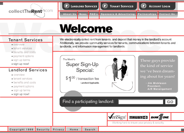 |
The basic process is to take whatever you've designed, and flatten that design into two layers - background and foreground. The foreground then comes apart into pieces, much like cutting apart a newspaper or jigsaw puzzle. Refer to the Dreamweaver lecture for more specifics on how to set up a site, but as a rule, create a separate folder that will contain only GIFS, JPEGS and HTML files. Most projects actually set up an "images" folder inside the site folder, so this is a good practice to follow, but not required. Notice how this page was laid out so that it can clearly be broken down into component pieces, which align in a regular grid pattern, how the page can be divided up with straight lines. None of the pieces encroach on or overlap the area of any other pieces. The basic HTML tag being used is a table, which can be broken down into rows of columns. Individual cells can be merged, but all the pieces are always rectangular in shape (or a curved shape on a rectangular background). |
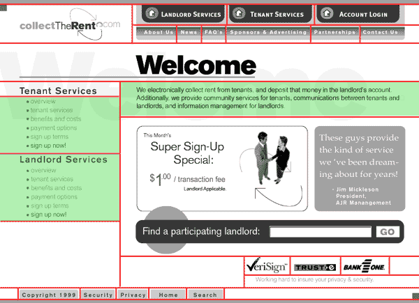 |
Since the web does not support many fonts (Arial, Helvetica, and Courier are about all you can guarantee), the design needs to allow for some text to in fact be part of an image (because of the typeface and the way the text is manipulated to desired affect, as in a button for instance). In most cases, it's best to create the table or layer that will hold the actual text, then paste or type that text into the editor, as in the green areas on the left. Actual text is used when content is likely to change more frequently, or when there is a large volume of text that is "stored" in a word processing format for editing and spelling purposes. |
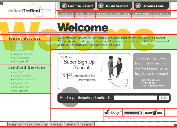 |
Although the "welcome" message is faint, when highlighted, it's obvious that it does cross sections and boundaries. In this design, the word would be spread across five different pieces. Because it's not critical exactly where this image falls, and because of the potential problems in having pieces line up exactly, putting "welcome" in the background is the way to go. |
 |
The layout is finalized by adding color, both for aesthetic reasons, and to define areas and meaning within the page. The colors are not arbitrary, but were selected from a web-safe color palette based on the company's identity and logo. The final image is then broken down into its component pieces (as in the red-lined illustration above), and each image is saved separately as a GIF or JPEG, as appropriate. These pieces are then inserted into a table in Dreamweaver. It's typically easier to create such a table first, and set its border size to "1" in order to see it and work with it before finalizing the page. |
borrowing and stealing
By far the easiest way to build a web page is to steal someone else's. Simply find a page you like, and choose File / Save As, and grab the HTML that creates that page. There are even tools (Webwacker comes to mind) that will copy entire web sites onto a local drive for you. There are three good reasons to do this: you learn how someone else did it by example, you use something you don't necessarily know how to create, and, obviously, it's fast. Note that this technique works best on pages that are HTML-only; today, a page can use Flash, CSS, javascript and server-side processing, or rely on inheritance for some of its properties, so copying the source isn't guaranteed to work.
I'm not of course suggesting you simply steal someone's site, rather that you utilize another site's code to speed your implementation. There's a substantial difference between constraining your work to someone else's, and using someone else's work to facilitate your own. In the code development world, re-using code is actually encouraged and planned for, and works extremely well to speed development. Class inheritance is based on this premise, as are Cascading Style Sheets. Because the HTML is visible to the end user, it's a readily available resource for web site development.
no man is an island
One final note on creating the images, text, HTML, folders, style sheets and more that comprise a web site — it's important if not in fact required to consider the overall development process and life cycle of the web site. Developing good habits regarding naming conventions, file and folder structures, and retaining many design file iterations should actually be a part of the design process. You or another designer or developer may need to revise the design or the finished site, and in a professional setting, it's likely that many people collaborate on a site, and virtually all sites evolve and change over time. Clearly naming and organizing the image and text files you create that make up or go into a web site will save countless hours of work down the road; if not for you, then for someone else.