Graphics, Images, Icons and Text
framing the possibilities
In many ways, the web is a return to an oral, non-linear way of communication. It is as much an iconic language as semantic, where context means everything. Color, icons, branding, style, structure, maps — all are ways to help inform the user of what they're looking at, where they're at relative to "everything else," where they can or might want to go — a way of framing what is known, and what one's choices are.
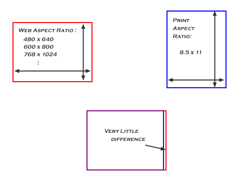
The framework of the web is fundamentally different than other media. Largely horizontal, it is seen more in the manner of a scroll than in our conventional 8.5 x 11 paper. Adding to the problem, there are always many layers of information — text / content, such as the words in this lecture, which a user more or less expects to be framed as it would on the printed page, and the visual context — the choices and options, which one wants always at one's fingertips, easy to read, to follow, to find and to choose. It is a subtle task for the designer to convey meaning and context in just the right proportion, and just as difficult for a user to learn new ways of following the pathways to an idea in an ever-changing environment.
 |
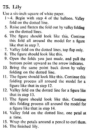
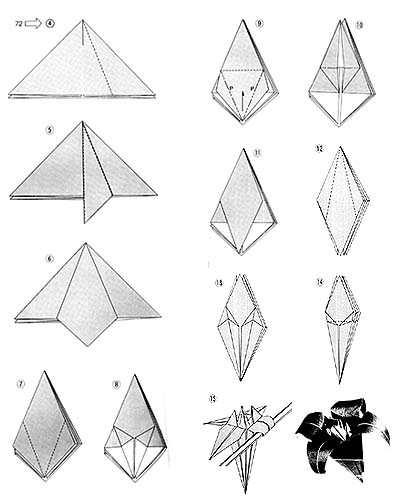
There are many ways to effectively layer information when designing information for electronic media; it is important to realize that every detail matters — color, size, space, position — every aspect of what you see can and should be a visual cue and convey meaning. As with all communication, and particularly electronic communication with its speed and density, you must have a high signal to noise ratio to make the possibilities clear. Unlike print, and text in particular, the medium (a television screen or monitor) is by definition fuzzy — people don't generally read on the web, certainly not the way one reads a book or a newspaper. Consider again the simple example of how to fold a flower in both its text and visual forms:
|
Left-brain right-brain issues aside, the images on the right reveal their purpose far more quickly and decisively than text could hope to do, and to a far wider audience — text and language become almost irrelevant to the image on the right. Perhaps more accurately, the images on the right have a language of their own that supersedes the verbal.
the language of icons
Ultimately, the web provides a basic or common ground upon which everyone can navigate and communicate. Not knowing who is listening, or whether they speak a common language, not knowing a frame of reference, the web has rapidly begun to develop a visual, iconic language, borrowed in part from the computer interfaces of today, but organic and all its own at the same time. Every site, a message in itself, is often forced to "explain" its language up front — frequently, icons and words are paired to educate the user: "these are your choices."
Icons are an effective way to "store" a lot of information in a small space, and they usually take their cues from the world around them. There as many and more ways to say "water" as there are languages, but virtually anyone will recognize a picture of a cup of water without using words at all.
The shape of the medium, its resolution, and the iconic language it inherits from software in general, all affect what you see and how you see it. To speak of graphic design is to miss the point of the web entirely — every aspect and choice, including what format to encode the information in, and how to offer choices and threads, all affect what someone finds, what one sees. There's simply no room in good design for useless information — there's too much else to convey; designing for the web involves designing the totality of the information a user will see, not merely choosing colors and creating graphics.
All too frequently, web sites borrow their visual language from the book, the newspaper, the television, but the web is none of these things. The content may be the same, but framing a structure around that content must be appropriate to the medium. It's important to identify to the user what is what upon the page — clearly delineating between navigation and content through arrangement, color, shape, response; carefully "spelling out" the architecture or arrangement of the site.
Putting a menu in a row or column, keeping it constant while changing content, surrounding it with its own color field — there are many ways to set apart the active and passive regions of a page. Likewise content, with larger and smaller themes woven in through type size, color, prominence, etc — even if the content is entirely text, it still comes in pieces of ever increasing size (word, paragraph, section & heading, page). People inherently "iconify" or "objectify" what they see, separating the pieces in their mind — the more guideposts, the more layers of consistency you can provide, the easier you make the user's journey.
ROY G BIV
Color plays an important part in framing meaning for the observer. Consider how the textual content on this page, despite its dominance of the space, becomes "quiet" in the presence of the brighter headers, links and illustrations on the page. Color-coding structural and syntactic elements makes it easier to see or "read" the various fields and sections on the page. Though the contents of this page are largely text, color, in conjunction with space and position, helps quickly draw the eye through heading, sub-heading, content, illustrations and choices, and allows the eye to "render" the page into its component pieces. Ultimately, giving the user a context creates different ways for the user to absorb the available information, and make an appropriate choice (do I read on? skip through the sections? follow that link? ...).
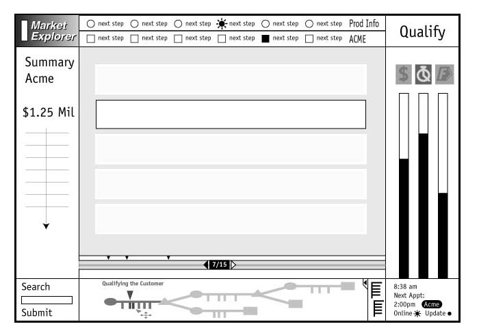
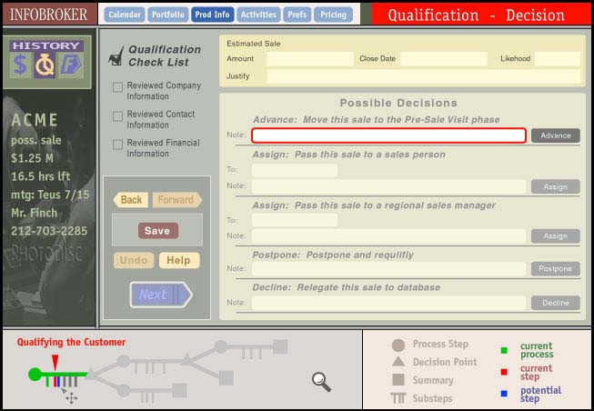
Following is a series of increasingly detailed designs of an interface for a sales-tracking database. A number of discussions were held with the client to determine what elements would be important, what interactions were expected, and what the available user processes and functions would be. B&W was used first, to help identify the core elements and options on the page, consider various page layouts quickly, identify what design elements would be used, and consider how to give priority to different areas of the interface. The branching graph at the bottom shows the overall process the user is engaged in, what's been completed, what the decision points are, and what's to be done next. Other areas offer information about the current process steps.
I consider B&W to be an important step in any complex design process; not everyone can see color ( due to color blindness, or simply monitor limitations ); using shades of gray helps create emphasis before choosing colors, and the resulting variations in hue can help augment the natural emphasis color can give. In these designs, content areas, menu choices, and various tracking tools have been sketched out within the interface, helping different aspects of the user's choices to come together into a coherent interface.
Once design began to solidify, color was added to provide further emphasis and cues. Notice how red is used to identify where the user is in the overall process, and what the next immediate steps are - red is "here". Changes in the hue also add meaning - bright red draws the sharpest focus to the next immediate actions required, more "grayed-out" hues of red indicate related areas of information. Blue highlights what the next steps will be; again brighter showing the next major step, with more transparent blues showing the larger context.
|
|
|

217
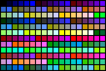
Ah, the web palette — why, oh why, are there 217 colors on the web? Who thought of that number? Well, first you need to know that the minimum number of colors most computer monitors can support is 256. You might remember that you can express exactly 256 different colors with a single byte, and since the byte is the smallest chunk of information computers deal with — 256 colors. Then, juxtapose the 256 colors from an Intel machine with the 256 colors of a Macintosh, and it turns out they share exactly 217 colors. Had there been a standard set of 256 colors identified with the advent of the color monitor, we might have 39 more colors in our world today.
Most design tools today offer a web palette of some kind from which to choose. When choosing an individual color or shade, choosing from the web palette guarantees that the color will be faithfully represented across browsers and platforms. Otherwise, when you store an image in a web-compatible format (e.g. a GIF or a JPEG), the colors you choose will be rendered into web colors. In this example, the "color" on the left is actually made up of two "web" colors, because the original color wasn't within the 217-color web-palette.
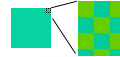
Aliasing (the combining of two colors to produce a third) is the computer's way of smoothing the naturally jagged edge that occurs at the boundary between two colors, or producing a third color from two available ones. All modern operating systems alias the text on the screen against the background color, which can be seen when you "blow up" a small section of text, or a small image into a large one, as in the text below. This can help make text more readable, or destroy the intended visual effect if it happens unexpectedly.
GIF and JPEG are both compression formats. With a 256-color palette, each pixel in an image requires one byte to specify its color; thus a 100 x 100 pixel image requires 10,000 bytes or 10K of space to store. Compression formats allow pixel-based images to be stored in a much smaller space by keeping track of how many pixels in a row and / or column are the same color. You don't have know how exactly how compression works in order to use it.
For an in-depth look at the web palette, compression formats, and making graphics web-compatible, check out Lynda Weinman, and her book, Designing Web Graphics. However, the five-second rule is this: use GIFs when you have large fields of solid color, such as an illustration or line drawing; use JPEGs for photographs, scans and other complex images.
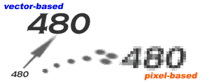
There is a significant difference between pixel-based images, and vector-based images. As with the text shown here, the original image is made up of tiny little dots — 72 per inch in fact (the resolution of all monitors). A vectored image can scale up and down indefinitely, because it's defined mathematically. A pixel-based image has a fixed amount of information — making the image larger means stretching the available information over a much larger space, making the image appear grainy. Illustrator is a vector-based tool, Flash is a vector-based format for the web (though Illustrator does not currently output a Flash-formatted image). Photoshop is a pixel-based tool, GIFS & JPEG's are pixel-based compression formats for the web.
it looked ok on my screen
The entire point of the internet is communication, and the ability of computers and users to communicate readily with each other. In order to have communication, you must have compatibility — you need to know that everyone can readily see what you intended for them to see. TCP/IP, HTML, GIFs and JPEGs are open standards - formats for documents and images that any software, computer or operating system can freely utilize.
Despite the available of essentially universal standards, different browsers treat web pages and images differently, as do different monitors, available browser plug-ins, and even different browser versions. It's imperative when creating graphics and choosing colors for the web to review one's work on a variety of operating systems and browsers - all too frequently, something that looked fine on one computer with one group of settings looks very different on another computer or in another browser.
In general, it is good design practice to work closely with users and user feedback to understand how people see a design, interface, software product or web site. Make certain that the world sees what you wanted it to see.
through the looking glass
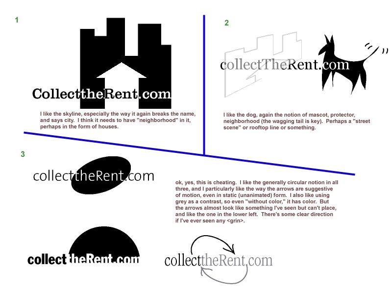
Finally, the following series of design images takes us from concept to web site. The designer first gave a series of treatments to the company name itself, strictly in black and white, offering different feels through line weighting and typeface.
Next, different graphic images are used to elicit different feelings and ideas, all in an attempt to convey a sense of what the company does, and to identify it with its market and its media. Again, this is entirely in black and white, using shading and hue to create emphasis.
Finally, color is added to the selected font and graphic, culminating in a corporate logo and identity. Notice the "large" range of hues and contrasts with only 3 color choices and a gray — any two of the colors can be safely combined to provide contrast for hyperlinks, for headings and content, etc.
|
| ||
|
 |
 |
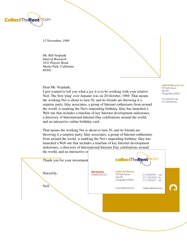
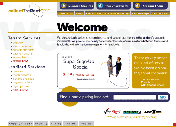
Now, different elements of the identity, including color, parts of the graphic image, and the logo itself are used to create letterhead (print), as well as two different looks for a web site. Notice how red is used in both web layouts to draw the eye to major decision points, such as links. In the first web interface, blue is used to identify major areas or themes, yellow to frame and to show sub-themes. In the second, the use of yellow and blue is reversed. In both cases, color is used to delineate between sections and choices, without much in the way of "illustration" — there aren't many excess elements or images on the page. Colored icons are used in conjunction with verbal choices, giving the user multiple visual cues.
|
| ||
 |
|
 |