Information Design & Modeling
what's the meaning of this?
When it comes down to it, everything is information — everything we look at, taste, touch, smell — it can all be quantified by information. There are 23 different letters, about 2,500 words and 11,000 characters on this page, which tells you absolutely nothing about its content or purpose. By itself, information can be meaningless; it is only when taken in some context that information has any real value. Information design is about meaning — assigning, conveying, even discovering meaning in a sea of data.
What exactly is Information Design? Well, have you ever sorted your books alphabetically? Organized your CD's? Rearranged your desk? Then you've done some information design. And although people have been organizing information for a long, long time, information design as a defined field of study is relatively young.
We have a tendency to think only of accumulated words and numerical data as "information" — conjuring up images of telephone books, databases, libraries, charts & graphs. Indeed, these are familiar forms of Information Design — someone has thought about how to arrange the information you're seeing.
But take a minute to look at the nearest chair. Is it plastic? Wooden? Metal? Does it have padding? Arms? A table attached? Is it in a long row of chairs, or sitting near a table or desk? The pieces and parts of a chair help inform us of its purpose, as does its context. The designer has arranged the features of the chair to suit its particular use; that same arrangement helps tell us how and where we might expect to find or use that chair.
Equally, however, we inform the chair — we are able to put it in context because we are familiar with the concept of "chair," and have seen one in probably just about every imaginable setting. We can distinguish a high-chair from an office chair because we've sat in both at one time or another. We imbue the chair with meaning through experience. Of course, the chair helps inform us of its purpose — its lines and materials have meaning and convey information about how you would use it; however, it is our own experience that lends context to the chair.
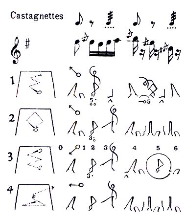
Information Design is the process of mapping complex knowledge and processes onto simpler structures that allow us to quickly grasp the larger picture. On the left is a map of a dance; by coupling the music, the dance steps, and the movement on the stage, the choreographer can indicate their intentions to the dancer without direct personal demonstration. By fixing some aspects of the dance and the music, the overall intent is distilled into a few simple images, allowing the pattern of the dance to be stored and transmitted in a way the dance itself could not be.
Relative to the Internet specifically, Information Design is the process of defining and structuring the information that will be made available to the users. It's tempting to think that this is merely a process of inclusion — picking all the things you want to say and show, and doing so, but particularly with large and complex sites, it is not nearly so easy. Deciding how to show meaning in the information you want to convey is an equally important part of the process; deciding what not to show can be just as difficult.
just show me
Perhaps the easiest way to explain is with a simple example. Consider this textual description:
-
The ecological interactions and considerations between building and technology created by heating and cooling are extremely complex, and involve water, soil, and air dynamics, as well as careful consideration of the interior and exterior spaces of the building.
This linear string of words is one way to "display" information. It may or may not have much meaning for you, and without reading it, it has no information at all — it's just some sentence.
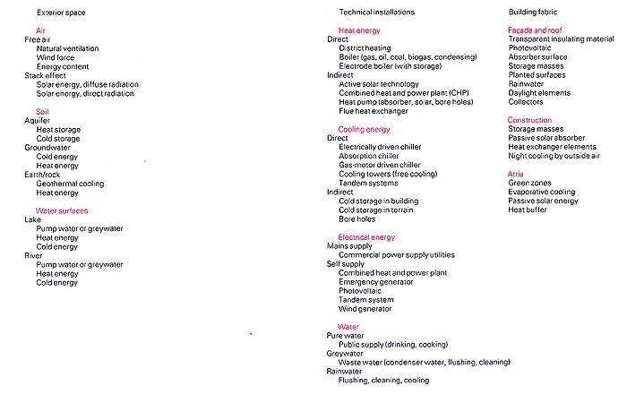
Another way to display "the same thing" is to list the various things that must be considered when designing heating and cooling for an ecological building, as in the image at left. As you can see, the description above and the list at left are distinctly different. Each includes and excludes different things, and each has a visually and logically different arrangement. They both "say" the same thing, but the illustration has added some new levels of meaning through the use of space, color, indentations and columns. Without reading the words at all, there is still a sense of meaning in the visual organization itself.
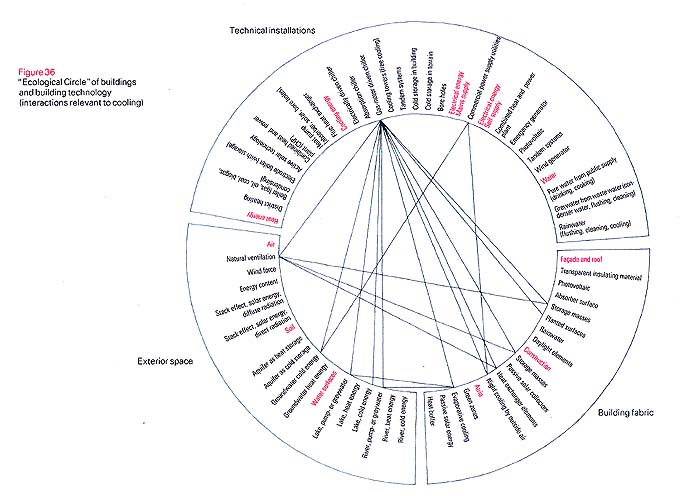
On the right is another way to arrange the information. Some of the hierarchical structure in the columnated display has been lost, but a new visual cue as to the interactions of various elements has been added. The physical arrangement of the data, now displayed in way that makes each element equal to its neighbor, without top or bottom, first or last, completely changes the way the information is absorbed and perceived. You can begin to see that deciding what to show, what to leave out, and how to represent different aspects of the overall message and its content can make an astonishing difference.
So although we speak of information, it is in fact meaning that we are looking for, and meaning requires a dialog — a speaker and listener, a figure and ground, a perceiver and the perceived. If we look to a chair to find its purpose, then the chair becomes the speaker — a dialog doesn't necessarily require two people, it only needs a question and an answer. Looking at the different representations of the same basic data in the illustrations above, it should be apparent that some arrangements are better than others at helping you understand what you're looking at by providing numerous layers of meaning that reveal themselves upon closer inspection.
Information Design is the process of revealing meaning to the user, whether the data is words, numbers, images or icons. It is the process of organizing data so that it will have meaning for its intended audience. And data need not be numbers or words — any information can be given meaning through organization and context.
"beauty is truth and truth is beauty, and that is all you need to know."
Good information design creates meaning through an intuitive organization that is, or should be, readily apparent to the viewer; the meaning becomes apparent through symmetry, patterns, colors, spacing, and all the elements and choices that have been combined into something I would call beauty. I think well-founded design, including information design, transcends anything obvious to become beautiful in its own way.

|
Both meaning and beauty can arise from a well-thought out visual structure. In the example on the left, something as simple as a Japanese train schedule takes on a beauty merely from its structure. That is to say, it is merely a list of times and engine numbers, unembellished, without any extra graphics. Yet the designer has visually organized the schedule in a way that is both meaningful (e.g. you can tell which trains have more stops) and visually appealing.
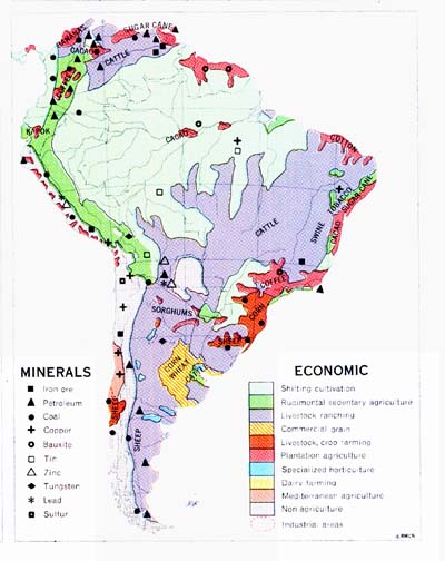
In the illustration on the right, the designer was able to summarize the socio-economic state of an entire continent by super-imposing colors, shading, and political boundaries on a map of South America. It isn't necessarily the information designer's role to make information look "great," rather that good information design is about creating clarity among and even between the ones and zeroes, the words and spaces, and that clarity can often lead to a beauty all its own.
The challenge is to find a structure that makes sense to everyone that interacts with the information; there are many more "users" than just the end consumer. The programmers, database experts, visual designers, content providers, technical support team and more will all have to "use" the data that makes up a web site. Part of what I think makes an information structure beautiful is its ability to appeal to its entire community.
Ultimately, we perceive information through structure, by distinguishing between figure and ground. It is the task of the information designer to make certain that there is meaning in the underlying structure. Good information design is able convey meaning quickly, concisely and consistently. Finding a cohesive structure that is able to quickly impart the same meaning to many people, with the elegance and grace that good design demands, is deceptively difficult. Done well, it can be incredibly beautiful.
( I highly recommend Envisioning Information by Edward R. Tufte for more on beauty and Information Design )
castles in the sand
One challenge particular to the internet is that of designing around dynamic information. Books, magazines, newspapers — they are all static media. Even television is a pre-programmed one-way broadcast medium, and the only real option you have with a program is to turn it on or off. Not so with the web; the experience can be tailored to each individual, the underlying information is constantly changing, and the viewing context is incredibly dynamic. What you see is intrinsically bound up in what you do to get there. On the web, an information designer cannot rely on a linear presentation, or a fixed frame of reference; as a result, the structure itself must provide context, despite the fact that the particular content and session are always unique. The same information can appear on many pages, in diverse contexts, and on a variety of platforms. The web is fundamentally interactive and dynamic. As with quantum physics, you must interact with the medium in order to observe it, changing what you see as you pass.
How do you decide what belongs and what doesn't? How do you create meaningful relationships in the data? How do you show the right information to the person who's asking? How do you personalize an individual's experience? I think one of the best ways to provide a working framework and identify appropriate content is to first and foremost put yourself in the position of each and every viewer: If I were them, what would I want to see, what would I actually be seeing? The very first thing I do when designing an information structure, such as a web site or database, is to write down a long list of questions I think any relevant user is likely to ask. This includes not only Joe & Jane Internet, but clients, technical staff, management, competitors — anyone likely to be using or working with the site.
One hallmark of good design is that the end experience makes sense to everyone who participates, from the casual passerby to the most intimate user. Perhaps the biggest mistake a designer can make in this regard is to focus on whether or not they like "the design," whether or not it makes sense to them. Far more important is to question whether it makes sense to everybody else.
Dynamic design is inherently non-linear. Rather, meaning and structure must be carefully layered. The experience should be much like peeling off the layers of an onion; the designer must create the right contextual layers for the infinite onion of the web. From general to specific, the site must pose questions or choices that help identify the user and their goal. Is this a new user or a return visitor? An employee or a client? Classifying the user helps identify the questions or choices to follow. Someone who's used the site dozens of times isn't likely to have the same goals or needs as a first-timer. Understanding each particular user helps a designer create a context specific to the moment, and effectively layer meaning within a dynamic environment.
joining the class system
![]()
Two important concepts intrinsic to non-linear design are Object Modeling and Inheritance. A great deal has been written on both in the computer programming industry (Object Oriented Programming, or OOP has been around for 30 years or more), and they are directly related to each other. Much less has been written on applying the same kinds of techniques to information design as a discipline, despite the applicability. The basic idea behind Object Modeling is to encapsulate information with a set of properties (about the information) and a set of behaviors (ways to get, put and change the information — to interact with it). Non-linear design is so important to the Internet precisely because information is not a thing, it's a field that ebbs and flows. By digitizing the information, it can be treated discretely, in pieces and parts, as an object. Creating objects with relationships allows us to control the flow and the perception of information, which is the goal of information design.
Inheritance is exactly what it sounds like — the ability to pass information along from one structure or object to the next. Inheritance, and the corresponding ability, possession, define the relationships between objects. You know what a "real" object is; in the world of technology, "object" is a term for a set of code that models a real-world object, containing information about the object (properties), and possessing the ability to mimic a "real" object (behaviors). Typically, programming objects are grouped into "classes": a set of objects that possess the same basic properties and behaviors through inheritance. More specific objects inherit basic properties and behaviors from less specific objects, building on or altering the behavior of the parent to create a new, more specific and robust set of behaviors.
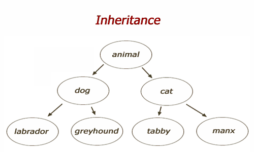
The illustration on the left is a simple example of basic inheritance. Each descendant has all the properties and behaviors of its parent, plus its own more distinguishing features. When designing an information structure, be it web site, software application, database, etc., the primary goal in an object oriented structure is to identify general characteristics that can be grouped, and then built, developed or written once and re-used in more specific cases. For instance, Cascading Style Sheets (CSS) use inheritance to define the look and feel of a web site by defining a master sheet for the entire site, then specific sheets for different areas or pages on the site. Each descendant can specify or even overwrite properties of the parent. This allows you to define and change areas on a page or the entire site by changing a single style sheet, rather than each page individually — a very powerful design and development tool. A number of design tools allow pages and web sites to be defined and built this way, allowing you for instance to create headers and footers for a section or the site instead of on a page by page basis. A page header on page one in Microsoft Word is inherited by all subsequent pages unless a particular page overrides its inherited header (or font, or other properties).
On the right is an object model, which attempts to show a number of "things" and their relationship(s) to one another. These objects might correspond to database tables, code modules, and / or data entry sections of the web site. Objects can have two basic relationships — inheritance and possession. Thus in this illustration, an Entity has a Session, which has a Locale. An Organization inherits an Entity's definition, and can have both many sub-Organizations, and many Users. A User can have many Roles, etc. etc. Such graphs are typically used to model the pieces and participants involved in complex interactions (such as between clients and company, or between users and web sites, etc.).
![]()
![]()
In the remaining two examples, two different visual graphs are used to illustrate the complex way that Navajo categorize objects in the real world. In both cases, categories get more specific as one moves from left to right — categories on the right inherit more general qualities from categories on the left. The design goal is to condense things that are unique to a single place or category, and allow related objects, pages and information to be defined by inheriting from a parent class.
Defining concepts and code in one place allows design structures and complex programs to be built up from simpler pieces. Efficiency in design and expression provide appropriate contextual layers — the structure itself helps conveys meaning. Inheritance and Object Modeling are complex ideas and tools — entire courses and books have been devoted to these subjects — though conceptually simple, using such tools to design effectively takes time and patience. Nonetheless, both Inheritance and Objects are powerful tools in designing dynamic information structures. As with CSS, or headers and footers inside a Word document, there are simple practical ways that you may already be using such ideas; fully understanding the basic nature of information, its structure, its meaning and its media is critical to the success of any good design, and every good designer.