Interaction & Design
the power of touch
The purpose of Interaction Design is to create a means for the user to manipulate information, both literally and figuratively. Literally in the tactile sense of point of click — being able to pick up and put down pieces of information. Figuratively in the sense that one's actions affect what one sees; that there is something upon which one can act and against which one can react. The end result of Information Design is the structure and content with which you interact; the end result of Interaction Design is the means with which you interact with what you see, the ability to manipulate and pass through the structure that Information Design creates.
Language gives us the fundamental power to quantify information, and the computer gives us the power to digitize that information, creating discrete electronic bits and bytes out of the overall flow. Coupled with digitization come the tools to manipulate these discrete units; first, the keyboard and monitor, then the ability to point and click — to literally pick up information and move it around. The web extends the benefits of this human computer interface by connecting all computers, allowing everyone to see and interact with virtually every piece of information known, and creating literal connections between discrete files. Understanding our ongoing interaction with information, and the nature of the medium in which we interact, is critical to designing for the web, or indeed for any information structure available on or through a computer.
As with any new medium, the web's first forms and usages echoed the cultures and paradigms of other media. Thus we have web sites that act like brochures or other print media, web sites that mimic the one-way broadcast of television, web sites that utilize the pastiche of the newspaper, and web sites that follow the formula of the book. But the web is none of these things, though its content may be any one of these media.
Neither is the web a mass medium. For instance, can you name a web star? In fact, no one person is famous on the web the way they are on television, or the newspaper, or the big screen, or the radio. Mass media defines and creates its own impersonal reality, a reality which is bigger than life — it speaks to and informs us. The web is entirely about personal interaction, and finding what you want; through your interaction, you inform the web. The web is fundamentally defined by our interaction with it.
Interaction requires both action and reaction; it is dynamic and active in precisely the opposite way that television is passive and therefore static. On television, you always know what's next, on the web, you never do. You listen to and watch the television, but you demand answers from the web. To understand interaction design, it's critical to understand that though the television picture is always moving, and by the comparison the web may frequently seem to be sitting still, nonetheless, the web is the dynamic medium. It's dynamic in respect to us - it requires our participation. McLuhan argues that TV is participatory, because it requires our mental participation to fill in the gaps and voids. But television lacks the tactility that the computer offers, it lacks our direct ability to affect what we see.
lines in the sand
The goal of Interaction Design is to create the physical and mental "handholds" against which a user can push, pull, twist, turn, flip, or click. Quantifying and grouping information creates a foreground of meaning against a background of "space" - the literal spaces between words, paragraphs, and margins; the edge of a picture or an illustration against the page; the lines formed between areas of different color — putting gray behind a sidebar or a menu for instance, or the glow of color surrounding a link within a field of text. You can't pick up a cloud, but you can interact with it, because it stands out from the background of the sky, and can be mentally contextualized as a thing.
It's about creating boundaries, the juxtaposition of one thing with or against something else. Boundaries are borrowed — they require a cognitive context, a culture. Whether from the web at large, the context of a given site, from other media, from a particular community, or from a social culture, we draw lines and boundaries to create meaning by referencing other contexts.

Boundaries can of course be physical, but sometimes they are more abstract. A button becomes a rollover, emphasizing its relationship through additional cues as to its purpose. In the illustration at left, there are obvious "boundaries" between each figure; we can draw boxes to emphasize these boundaries, but even without hard lines, we mentally divide the figures by perceiving them against the background, and through their physical arrangement in space. In point of fact, the illustration quite clearly "reads" more clearly without the actual lines; making the images gray and the motions red more clearly draws the eye to the motions, which the is actually the primary purpose of the illustration.
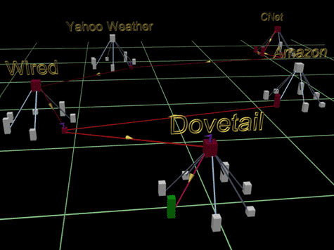
In the same way, we create mental boundaries around individual web pages, and around web sites. The "distance" between a page on a particular site is shorter than the "distance" to a different web site, despite the fact that everything is only a link away. Illustrated at right are the linked relationships between pages on a given site, and between a number of different sites. We divide the sites in our head the way they've been illustrated on the page, although no such divisions exist on the web itself. This is precisely the challenge to the Interaction Designer — to understand how a user will perceive and divide that which they see, and to visually emphasize those perceived boundaries to facilitate understanding and interaction. In both illustrations, the use of negative space, the absence of actual boundaries more clearly defines how we are to mentally group and divide the concepts the images represent.
Though interaction seems tactile in nature (because we must physically interact with the page), it is first and foremost a mental exercise. In order to reach out and touch something, you must first perceive it as something which can in fact be touched. You must mentally divide something from what you see or perceive before you can physically interact with it. As designers, we create these boundaries through the use of color, space, and shape; we can add to the overall impact by borrowing from community, culture, language, the medium of the computer and of the Internet, and from other media in general.
The challenge then is taking something large and complex that you understand and are familiar with, and breaking it into its component pieces, and drawing boundaries between and among those pieces. Specifically, the goal is create a set of objects, pieces, or groupings that you expect will make sense to the intended audience.
stop the world, I want to get off
One of the biggest hurdles in designing for the web is that, unlike a book or movie, there is no beginning nor end to the web — it is non-linear and non-terminating; at best, casual or first-time visitors get a glimpse of the overall structure. Framing a user's experience in a way that is effective upon both first glance and after much experience, while always giving them the tools to know where they are and where they can go is extremely difficult. How to you provide entrances and exits in a show that never ends, particularly without interfering or cutting short someone's experience?
Consider the atom: without having seen one, the Greeks considered the atom to be the smallest form of matter (the word atom means indivisible), and in some sense, they were right — the atom is the smallest form that matter and the basic element can take. We now know that every atom is made up of 3 yet more basic pieces (proton, neutron, electron), and that those in turn are made up of still smaller pieces (quarks), which appear to be made of .... Looking outward, we can combine atoms to form molecules — the building blocks of the things we see around us every day. Pile enough molecules together, you get a planet. Then a solar system. Then a galaxy. The very universe in which we function appears to be infinitely large, and infinitely small. Yet here we are, walking and talking and eating ham sandwiches — navigating comfortably through the universe without knowing all its component pieces, nor its overall scope. Every day, we get through our little slice of the universe by recognizing the basic and elemental things around us.
In the same way, we can ground a user by weaving themes from the basic elements available to us: colors, buttons, words and shapes. Drawing further on the language of the web, we educate the user about their experience, using building blocks they are already familiar with. For instance, by providing a menu of options, and placing it at the top or left of the page, we give a user a sense of where they are. Coloring and sizing text, highlighting links and arranging pages in a thematic style lets a user know they are on a particular site, or in a particular area of a larger site. Coloring the background and grouping the elements on an individual page helps a user navigate by visually organizing the disparate elements of information he or she must navigate through.
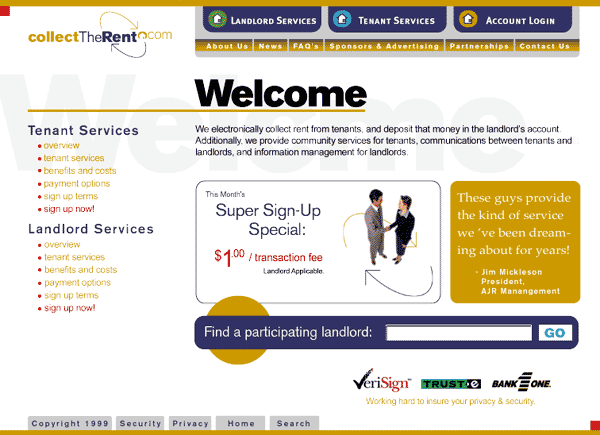
The illustration on the right is immediately recognizable as a web page, despite your never having visited the site. The large "welcome" lets us know we are "home," or at the beginning of our experience. The areas of the site are clearly identifiable in the menu along the top, which is itself readily recognizable as a navigation tool by being separated from other elements on the page, and through the use of color and breaks between the buttons. The menu along the bottom offers a set of meta-options that deal with the site as a site, delineating it from areas within the site as identified in the main menu along the top. Drawing on the culture of the written word, which is always arranged from left to right and top to bottom (at least in Western culture), emphasis is place on the top menu, making it the main menu from the get go.
Good design should be invisible; rather than hammering the user over the head with the design itself, good design should facilitate the user's experience, guiding and helping them navigate through the content and structure. Even the site you are on now, with almost no graphic design elements, has a style — not necessarily one that you would recognize as such, until you leave the site and arrive somewhere else — the jump is alerts you that your context has changed. Consistency of design elements helps the user build up a larger internal picture, perhaps without even being aware of it. A user doesn't need to see a site map in order to click on a link or recognize a page. The key to providing a user with the ability to interact is to provide an organization and structure that can be grasped and manipulated, both literally and figuratively.
mine's bionic
The Internet offers an ever-increasing cornucopia of tools and technologies to confront the user and offer new means of interaction. From humble beginnings of text and only text, the Internet now offers the designer images both static and moving, audio, video, animation, 3 dimensional worlds, real-time chats and more. Through Java applets and javascript, as well as technologies such as Flash and Shockwave, the page itself can exhibit behaviors of any conceivable kind. Although I discuss this more thoroughly in the lecture on tools, I think a brief word on using these technologies to create interaction is in order.
Interaction is about offering the user choices, and the means to exercise them. Interaction is not about keeping the user busy. The purpose of any web site is to engage the user in a dialog, in an exchange between the author(s) of the site and the users at large. The role of the designer is that of facilitator, not magician. It can be all too tempting to take advantage of any and every new technology merely to wow the user, but the goal of the design is communication. The designer should be focused on impressing upon the user the underlying message through technology, instead of trying to impress the user with technology — technology is the tool, not the goal.
First and foremost, the designer must focus on what needs to be conveyed, and how to structure that message. Then and only then can the one look to technology for the means to convey those messages.